Over the past few months, I have collaborated with Concinnitas Farms, an Oregon-based vineyard that is dedicated to discovering new grape varietals capable of unlocking the untapped potential of the Willamette Valley. The vineyard is strategically positioning itself to offer a curated range of high-end wines, catering to both restaurants and discerning direct buyers.
During this collaboration, I played a key role in crafting a distinctive logo and font, carefully tailored for application on their wine bottles and other branded materials.
Winged-Eye Logo
"Concinnitas" finds its origin in the lexicon of Leon Battista Alberti, a prominent humanist Renaissance thinker. This term encapsulates the concept of "an elegant or skillful joining of several things; beauty of style." In choosing this name, Concinnitas Farm aligns its mission with the sophisticated approach of expert winemakers in Oregon, endeavoring to apply these established methods to novel grape varietals—a harmonious fusion.
Leon Battista Alberti, known for his intellectual contributions, notably adopted a winged-eye as his personal emblem. In a subtle homage to Alberti, Concinnitas Farm has incorporated a similar icon into its logo. Both the logo and the farm's winemaking techniques are characterized by their idiosyncrasy, reflecting a commitment to uniqueness and excellence.
The Font
I crafted a font inspired by the text adorning the façade of the Basilica of Santa Maria Novella, designed by Alberti. This font seamlessly blends the refinement of a traditional serif font, reminiscent of inscriptions on ancient structures, with hand-drawn flourishes and imperfections. These artistic elements encapsulate the distinctive and personalized ethos of Concinnitas Farm, reflecting its unconventional character.
Label
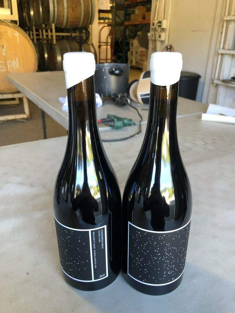
With the aim of marketing this wine to collectors and restaurants as a sophisticated choice for special occasions, our focus was on maintaining a clean and refined label. However, we also valued the connection to the farm. Each label features a star map depicting the night sky on the evening of grape harvesting, subtly tailored to the specific grape varietal. The label’s design ensures that when viewed straight on, only the star map is visible on the bottle, requiring a turn to reveal any accompanying text.

